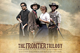
I sometimes provide graphic design for other companies, but it's not my favourite pastime. Creating the artwork for a show is, for me, no different to writing it, producing it, or directing it. It's a significant part of the creative process that fills me with confidence.
Sometimes people can worry too much about a poster. The best poster in the world can't save your show if the show is no good. But a terrible poster probably could harm a decent show. I always set out to create something that I want to represent the company, the show and the brand. Something that would make me get up and go to the theatre.
The following is a mood board of posters that I loved and felt would be a good starting point when I came to creating the artwork for The Frontier Trilogy. There's something similar in all of them, as I suppose there is in all Western posters. I enjoyed the washed-out, gritty texture of DJANGO, the sense of mystery and danger in LONGMIRE, the wanted poster paper effect in 3:10 TO YUMA, and the impression of distance and scale in HELL ON WHEELS.
The final artwork for The Frontier Trilogy. Whilst clearly influenced by the examples above, I hope it achieves its own style and impression.
A challenge I have always faced designing the brand for a trilogy, is that each show has its own voice, and yet the artwork must cater for all three voices in one image. Had I been making a poster for only one of these plays I imagine it would have looked very different.
Beyond creating the image for the three shows, there is also the brand of the company to take into consideration. Our previous shows (and their posters) have been seen in Edinburgh for some years, and it's important to me that an audience can recognise our artwork in the overcrowded streets and bars across the city. But it's also vital that the image moves forward, changing and improving each year (as hopefully the shows do). Despite the similarity in branding, The Frontier Trilogy is as different from The Bunker Trilogy as The Capone Trilogy was. I trust in our audience and followers that they'll know the shows by the brand, and know that we'll deliver something even bigger and better than than we've done before.


No comments:
Post a Comment